
Alaska Notes: Beginnings of a New Series
This was my first time seeing real mountains.
Not just the snow-capped volcanoes I’ve seen in Japan - but dramatic, layered ranges that feel ancient, wild, and unknowable. In Alaska, the landscape hits you with its scale. It doesn’t just surround you - it dwarfs you. It quiets you. There’s no avoiding its magnitude, or the sense that much of it is still truly untamed.
I travelled by ship, which added a kind of floating stillness to the whole experience. The slow movement allowed me time to observe, and the way the land revealed itself - through fog, light, and shifts in perspective - reminded me of sumi ink or marbled paint drifting in water. I kept thinking: how can I paint this?
Below are a few of the visual notes I took - each one striking something in me I’d like to explore further in paint. And below that are some of the more impressive photos I managed to land.

A floating mountain in the backdrop of a city is not something I imagined. Seattle (where the ship left off) reminded me a little of Sydney, with its proximity to so much water - but the ghostly silhouette of Mt Rainier isn’t familiar to anything I’ve seen in Australia (or anywhere, really). It felt like a presence more than a place. Locals say, “The mountain is out today,” as if it decides for itself whether it wants to appear. Seattle probably needs a post of it’s own as I’m now a Seattle lover for sure. My friend in Hawaii, who was raised in Seattle, says “there’s just so much fleece” (referring to the outdoors types). LOL! That might be why I like it ;)

There’s an epicness to the land here that’s hard to put into words. You sense it in your bones. Everything feels older, larger, quieter. There’s a kind of reverence required of you.
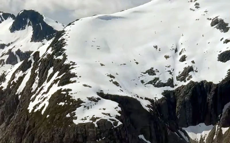
One of the most visually compelling things for me was the contrast between jagged rock and soft snow. The snow sits like meringue or marshmallow - pillowy, organic forms against rigid geology. I’m looking forward to experimenting with this contrast in paint. I think the fluid media I use could work well to capture that interplay - pouring softness over structure.

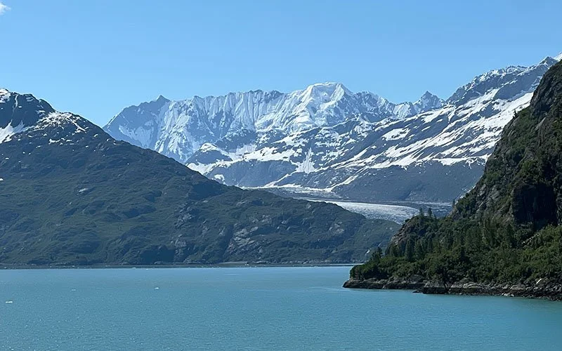
I hadn’t expected to see floating ice in the water - I thought that was reserved for more northerly places. But Glacier Bay was full of them. These small sculptural forms - ice carved by glacial calving - are called “bergy bits.” I love that term. They seem whimsical until you remember their origins. They drift by silently, ephemeral and ancient at once.
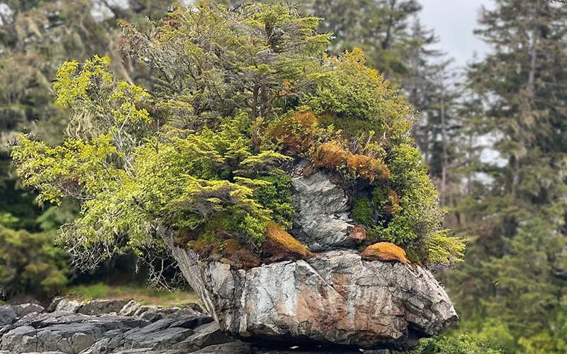
This boulder is known as a glacial erratic - a piece of earth carried by a glacier thousands of years ago and dropped far from where it began. This one was especially beautiful, home now to mosses, crustaceans, and tiny naturally forming bonsai. A microcosm born from a moment of ancient violence.


The ice itself has a presence too. Its density and age filter light in strange ways - leaving only this piercing, saturated blue. It’s as if the glacier is lit from within. On the surface, it sometimes looked like salt crystals. I kept wanting to reach out and touch it, to understand its texture, its weight.
This journey has seeded something. I don’t know exactly what the body of work will become, but I can feel it growing - like those bonsai on the erratic. Quietly, slowly, but with roots.
If you’d like to see how these impressions evolve into paintings, sign up to my mailing list to be the first to know when the new series is released.
More soon.
~ AK


